iPhone式开关的CSS源代码
2014-03-15
这是前几天在大前端看到的一样好东西,以后可以好好利用上的了。这些代码是基于CSS3的,对于webkit内核的浏览器支持良好,大家可以好好试一下,特别是做前端开发的同学们。
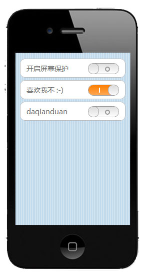
首先先上html代码,居然只有区区一行:
<span class="onoff"><label><i></i></label></span>
然后就是大片大片的CSS代码了
.onoff{
	overflow: hidden;
	display: inline-block;
	margin:0 0 -5px 15px;
	width: 60px;height:20px;
	border-radius: 20px;
	border: solid 1px #999;
}
.onoff label{
	display: block;
	margin-left: -40px;
	width: 100px;height: 20px;
	text-align: right;color: #8B8B8B;border-radius:20px;
	background: -webkit-gradient(linear,left top,left bottom,color-stop(0,#DFDFDF),color-stop(1,#FEFEFE));
}
.onoff label::after{
	position: relative;left:-17px;top: -20px;
	display: inline-block;
	content: '';width: 6px;height: 6px;
	border: solid 2px #999;
	border-radius: 10px;
}
.onoff i{
	display: block;
	width: 60px;height: 20px;
	border-radius:20px;
	background: -webkit-gradient(linear,left top,left bottom,color-stop(0,#FE7D00),color-stop(1,#FEA753));
}
.onoff i::before{
	position: relative;top: -7px;left:-15px;
	display: inline-block;
	content: '';width: 2px;height: 10px;
	background-color: #fff;
}
.onoff i::after{
	position: relative;top: -1px;left:1px;
	display: inline-block;
	content: '';width: 20px;height: 20px;
	border: solid 1px #999;
	border-radius: 50px;
	background: -webkit-gradient(linear,left top,left bottom,color-stop(0,#DADADA),color-stop(1,#FAFAFA));
	box-shadow: inset 0 0 1px #fff;
}
看样子真的是很复杂的东西啊~不说了,这里是大前端的实例:传送门